Through this project I have tried to push my boundaries’
through pushing my idea’s further. It past projects I have struggled with
having to narrow of a concept/theme, so for this project when I eventually set
myself a concept I made it broad, giving me room to explore and research different
areas of the ‘distorted reflection’ subject. This project has also put into
perspective where I think my work fits in the fashion industry and who
contextually I am inspired by. On reflection I would manage my time better so I
would have a larger and more substantial final collection, but I feel that the
final collection is very successful in the quality of the knit and within
relation to my brief and subject matter of distortion. I feel like I have
communicated my idea’s well from visual to practical work (knit) I think the
balance of colour through my collection is very successful in that the grey doesn’t
make the sample dull, as I have balanced it with highlighted areas in the shades
of peaches, blue and light silver colours. I also think that my technical
ability especially on the dubied knitting machines has improved greatly during
this project allowing me to expand the techniques in my collection and this will
also help me as I carry on through to unit X.
Sunday, 8 February 2015

Friday, 6 February 2015





Friday, 30 January 2015
.jpg)
.jpg)
.jpg)
.jpg)
.jpg)
.jpg)
Wednesday, 28 January 2015
Branding Project Final Collection
This is my final collection. I feel that with the
colour balance and the use of techniques it fits the Mark Fast brand but also
gives it a fresh new edge – I feel I’ve put my own stamp on it. Some of my
samples are unfortunately small however I think they are all successful. On reflection
if I had more time I would have explored more channels of technique- made
samples bigger and pushed my colour palette further. This brief has made make
work with materials i.e. Lycra that I wouldn’t normally use or be comfortable
with using, which has helped and influence my practice project in a positive
way in that I feel I can take the ideas from the Branding Project and use them
in my own project.


Friday, 23 January 2015

Monday, 19 January 2015
Branding Project
Continuing sampling for Mark Fast I have started to
consider how the sample from my collection will fit on the body. This sample in
particular is made to sit with the gap under the bust – the ‘mid-drift’ style. The
colour in this sample I took inspiration from his spring/summer 14 collection
gently adding and blending the colour in. I used Lycra to shape the gap and
pull it in.
Monday, 12 January 2015
Sampling - Branding Project
On starting to sample for the Mark Fast branding
project I found it difficult to use the Lycra on the domestic machine. After a
few hiccups of it falling off the machine I finally mastered the use of it. However,
I found that I had to cast on very wide, as the Lycra shrank back once off the
machine, which caused the samples to be more time consuming. This sample in particular
although effective shrank down once off the machine. The colours – particularly
the added green wrapped in give a warmness to the sample. I used the casting
off and on technique and E- Wrap in this sample, I think this sample is very successful
– although small and I intend to use it as part of the final collection.
Tuesday, 6 January 2015
Branding Project Development
Taking the idea of a ‘opened and closed structure’ I
have started to look at the concept of using the honeycomb structure combined
with the Mark Fast ‘style’ of the use of lycra together. I also will use these
initial images as a source for my colour palette.

Using the shapes and colour as inspiration I will
push this forward to create a small collection on knit samples for the Mark
Fast brand.
As Mark fast primarily uses the domestic knitting
machine I will use it for most of my sampling but will have added input of the
dubied machine as I feel with the use of lycra you get a more professional finish
on the dubied.
Tuesday, 30 December 2014
Live Brief
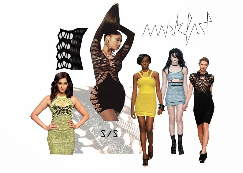
My chosen live brief is ‘The Branding Project’ which
requires me to research into a brand of my choice, and producing a sketchbook
of research, mood boards and a final outcome. My chosen brand is ‘Mark Fast’ I have
chosen Mark Fast as I feel his work is different to mine, his use of lycra
makes his work sculpt the body and he is known for his ‘open garments’ clothing
with a lot of ‘holes’ and open spaces.
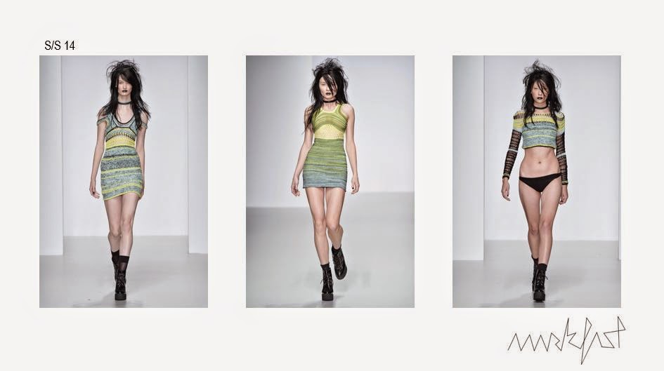
On researching all his collections, I took interest
in his latest spring/summer collections. I particularly like his s/s 2014
range, his collection is very punk esc – hip and alternative. I noticed that
through the collection he adds more colour – from greys to bright colours, some
garments being very colourful. I like how the colour comes in gradually, sort
of fades in.

As lycra is important in relalation to his brand I
intend to use it in my project. I intend to kick start this brief through the
idea of an ‘open and closed structure’ which I feel his garments are, they are
very detailed in areas, and then are open in other areas of a piece.
Wednesday, 17 December 2014
Developing Samples
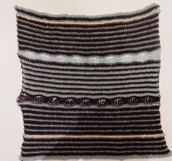
This week I have started to work on the dubied knitting machine, mixing the ripple and ribbing techniques together, this sample is I feel successful but if I were to do it again I would change the placement of the rib slightly higher rather than in the middle. I will take forward the way the knit expands on the ripple as it gets closer to the ribbing.

I have also started to work with the possibility of
manipulating the knit once off the machine. On this technique I used the
technique ‘Smocking’ stitching parts of the knit together. This created a ‘ripple’
in the knit and the colour followed the movement within the smocked area. I
intend to use this technique in my final collection as I feel I can shape the
knit how I want it to within relation to my research easily.

Friday, 12 December 2014
Developing Samples
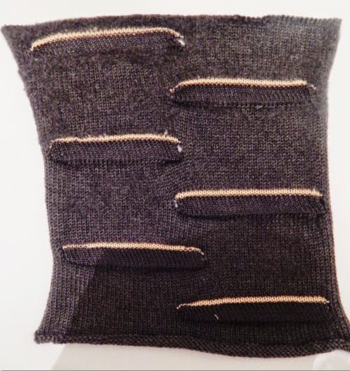
I also want to experiment with wire in knitting in
this project, so using the dubied machine I started to insert wire using the
inlay technique, I used a stiff wire so it was easy for me to mould it the way I
wanted. Once knitted I was able to shape the knit myself, I used it to make a waved
effect that I have in my research. But I need to consider if the wire is
wearable, if I take this forward as a design in my final collection I need to
find a way of the wire being safe to wear, as the ends could cut into anyone
wearing it. There is also the option of using a finer wire, which would not
have as much effect as the thicker wire but would give me mean to manipulate
the knit still. I also need to take into consideration if the wire is secure
enough – will it fall out of the knit? (sample below)

Friday, 5 December 2014
Initial Samples
From my research I have started to experiment with
techniques on the domestic knitting machine that I feel link to the shapes in
my research. I also have carefully considered my yarn, I have decided to use
mercerised cottons for the shiny/reflective quality, using mohair for use of
blurring lines and wools in parts to add stability. On choosing my yarns I had
to consider the intent of my collection. I want my collection to be an
Autumn/Winter range, so the use of wools I feel was needed. I also need to
consider my colour proportions, I don’t want to focus too much on the greys,
therefore making my knit dull.

In this sample I have used the hooking up technique.
This created a wave in the colours therefore giving the illusion of movement. I
think the colour proportions in this sample are not quite right though as the
sample, particularly the black and white are look quite stripy, I think this
could be resolved with adding mohair and then brushing it to merge the colours
together.

In this sample I also used the hooking up technique,
but used fewer colours, I find that if I added more peaches to this it would
become warmer – more rich in colour giving it a better quality.
Friday, 28 November 2014
Water Reflection
Looking more at the overall landscape (skyline) of a
city, I am interested to see why what means they are reflected. I have started
to think of things that reflective, the more obvious is water. Many city’s sit
next to water and through research I found photographs of those that reflect
into water.


Although the colours in these photographs don’t work
or relate to my own colour palette, the concept of the city merging into water –
morphing and distorting the reflection does.


Focusing on the reflection in the water itself, the
way the water speckles and waves as a light on the water is an interesting effect,
it is a reflection that you can’t tell what it is. It also alike how I created
my photographs changes with movement, water movement in this instance. From
this I intend to take the highlighted aspect and translate into my practical
work (knit).
Thursday, 20 November 2014
Reflection Marks
To capture the shapes and linier quality throughout
my drawings I have painted out the wavy, moving line which I have pulled out of
parts than run throughout my different interpretations. Using black as a base
colour I painted onto acetate, therefore giving me the opportunity to layer the
paintings to see what effect it has.
I also added wire to the layers. I made small wire ‘sculptures’
focusing on the shapes in my photographs, using different size wires depending
on how faint the line is.


The harshness of the wire next to the blurred
quality of the paint gives an interesting contrast. On reflection I could have
used more colours from my colour palette – the peach colours next to the wire
and harshness of the black would add a warmer aspect to the layered pictures as
a whole.
Wednesday, 12 November 2014
Clare Tough
Clare Tough is a knitwear designer. Her collection
are interesting because the knit is varied – parts chunky and part fine, her
work is almost like a patchwork, with pieces of knit joint together – it looks
as if you don’t know how it fits or where pieces place until there put on the
body.
She also uses a lot of colour in her latest collections, something that I
am working use more of in my work.
Her work is different and alternative, it isn’t commercial
at all, which I feel where my work sits, the fabrics I create aren’t for the
high street, the areas her work is placed – put on a catwalk or worn by alternative
celebrities or even used on model shoots.


Her work gives me the idea of joining pieces of my
knit together – creating a change in direction, relating to my distorted photographs.
Wednesday, 5 November 2014
Reflection Development
Continuing to use my city photographs, I further
explored ways to distort them through reflection. Holding them at an angle away
from aluminium paper, they created this image.


The photographs are also momentary and change
with the way you move – I created the photograph myself and could have easily
changed the shape and colour balance.
The colour pallete in these photographs is one I intend
to take forward to my practical work, the shades of peace, grey and black are
interesting balance with highlights from the snippets of blue and silver. My
yarn choices will be considered on the basis of the balance between the
reflective aspect and the colour balance.
Subscribe to:
Posts (Atom)