Tuesday 30 October 2012

Weave


When starting weave I was eager to pour all of my drawings and research so far into it. I had to consider my choice of yarns, the colour of my yarns,what I would introduce through my weft, and what patterns I would use.
The first step was creating my warp, I used fine cottons in 4 different colours, repeated to create a 'stripey' warp. this idea sprouted from tree 'finelner' drawings, as the use of varied fineline's were a nice underlying effect.
For the weft, i varied yarns, from very fine cottons to thick wools, this gave a changing/varying effect which i could see in my research (drawings/photographs).
I started to work with the colours on my warp, but looking back I find that the colours do not work, for instance, the purple is to bold/strong next to the other colours.


At the start of my weave I experimented with varying the yarns to see what effect it would give, I found that the yarn and pattern changed to often, as you can't see the detailed pattern I used.


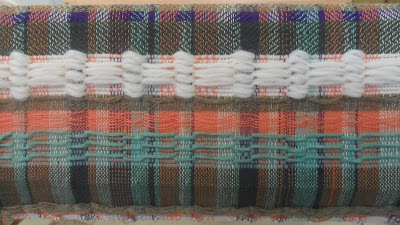
 I then started to look at different weave patterns that I could relate to. I came across the 'crater' pattern (as seen above) and found that the shapes and forms within the pattern were alike those in my drawings, with this in mind, I made the pattern using a green shetland wool. although this worked I felt a need to develop it further along, maybe vary the colours? vary yarns? I then proceeded to make the weave below.


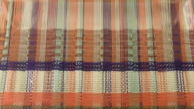
Using the crater pattern I tried to blend colours together, to create a tonal effect, I feel it created its own drawing within the weave.

 
Although this is just a 'plain weave' I feel that it was of the most interesting pieces of weave that I have woven. as my warp is so detailed and interesting, with a thick brown woollen yarn I wove through, giving it a textured surface.
 
 
I feel that i have translated all my ideas, inspirations and research into my weave and will continue to do so throughout the rest of this unit (knit).

Thursday 25 October 2012

Catherine Libmann

Bois De Bouleaux

 
Catherine Libmann is a contemporary Tapestry/Weave Artist. when looking for inspiration on my chosen subject I came across her in a book I have 'Tapestry: A Woven Narrative'. Even though I have texture and surface in my drawings/samples I find her work to have an deceiving quality, as even though her work is a flat tapestry weave, it looks textured, like it has a moving surface , as if its ready to 'pop out' of the weave!
I also find her use of colour inspiring, although the colours a dominant in there own right, they mold/blend together well, and the whites/creams lift the weave.
 

Thursday 18 October 2012

Mood Board
 
Using my body of drawings I have created a colour way, made up of 8 colours. I have explored with different tones and shades of colours - my enitial work on 'the colour way' helped a great deal when it came to mixing colours to get the correct shade/tone. i also had a look at the quantity of each colour I felt I came through the most/least in my body of drawings.


As seen on my mood board there is an example of the various yarn Wrapping i created - using the same colours, but in different compostions and of different quantitys.

Wednesday 10 October 2012

With the 'tree bark' idea in mind I have began a series of drawings, exploring the textures and surfaces of bark using charcoal (as seen to the right) and fine liner (as seen below). I found that the fine liner drawings took longer, but they made a more detailed textured effect and I think that it created an unusual use of line. charcoal I feel is not a good use of material as it does not create a nice shape, their is no contrasting lines  - no tones, it does not have the correct characteristics for the shapes/forms that i am trying to create in my body of drawing work.
As i have chosen construct as subject for this unit I now realise i need to bring these shapes forward and create/develop them through knit and weave. I first need to establish a colour way, looking at my body of drawings I find that a mix of dark and light shades give an interesting contrast/balance to my form.


Friday 5 October 2012

After using the leaflets, and other bits and bobs collected at Liverpool Biennial, I started to create and construct drawings to generate ideas and further develop my work, this drawing is a silhouette of a tree, but not everyone just see's a silhouette do they? We see shape, form, detail, texture!
I need to look further into the shapes and textures within the tree, and look at the different 'bark' and 'growth' on the tree.

Looking at this drawing in paticular, I think the colours in the background of the picture work well together, especially with the white oil pastel scratched over which gives it a pastel/pale colour scheme - perhaps i could use these colours along with the colours in the image of bark below to create some interesting compostitions.
As I have chosen to construct for this unit, I Know intend to look at what yarns and threads match my colour way and develop my drawings further to create shapes and textures.


Looking at the bark I feel i could create this
through drawing through contrasting materials
such as charcoal, graphite and fineliners -
this would create a textured surface - alike
 the shapes and forms on the tree bark.

Tuesday 2 October 2012

Developments From The Liverpool Biennial

After my trip to the Liverpool Biennial, I looked back through the body of drawings and items I had collected along my journey, as there was a vast amount I Began to look for inspirations for my journey, what did I see on my Journey? how did I feel? And what were my surroundings? thinking of the last question, i looked through my photographs and found the photograph below. without really thinking about my actual surrounding on my Journey, i had a large amount of photographs containing Nature. This I feel is the start of my Journey.


 Origins - Journeys - Nature - Tree of Life - Trees - Bark. 
 
with these words in my head I now must explore the 'nature - tree - bark' meaning further. thinking of what is nature? what does it symbolise? what does it mean in different countries? to different people? I need to explore its different shapes, forms and textures.