Tuesday 30 December 2014

Live Brief

My chosen live brief is ‘The Branding Project’ which requires me to research into a brand of my choice, and producing a sketchbook 
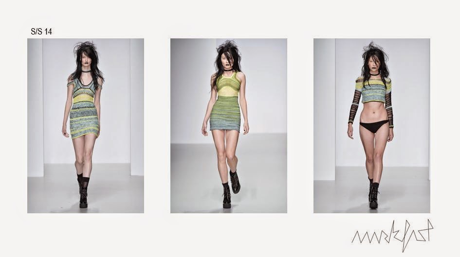
of research, mood boards and a final outcome. My chosen brand is ‘Mark Fast’ I have chosen Mark Fast as I feel his work is different to mine, his use of lycra makes his work sculpt the body and he is known for his ‘open garments’ clothing with a lot of ‘holes’ and open spaces. 

On researching all his collections, I took interest in his latest spring/summer collections. I particularly like his s/s 2014 range, his collection is very punk esc – hip and alternative. I noticed that through the collection he adds more colour – from greys to bright colours, some garments being very colourful. I like how the colour comes in gradually, sort of fades in. 


As lycra is important in relalation to his brand I intend to use it in my project. I intend to kick start this brief through the idea of an ‘open and closed structure’ which I feel his garments are, they are very detailed in areas, and then are open in other areas of a piece. 

Wednesday 17 December 2014

Developing Samples

 This week I have started to work on the dubied knitting machine, mixing the ripple and ribbing techniques together, this sample is I feel successful but if I were to do it again I would change the placement of the rib slightly higher rather than in the middle. I will take forward the way the knit expands on the ripple as it gets closer to the ribbing. 


I have also started to work with the possibility of manipulating the knit once off the machine. On this technique I used the technique ‘Smocking’ stitching parts of the knit together. This created a ‘ripple’ in the knit and the colour followed the movement within the smocked area. I intend to use this technique in my final collection as I feel I can shape the knit how I want it to within relation to my research easily. 


Friday 12 December 2014

Developing Samples

I also want to experiment with wire in knitting in this project, so using the dubied machine I started to insert wire using the inlay technique, I used a stiff wire so it was easy for me to mould it the way I wanted. Once knitted I was able to shape the knit myself, I used it to make a waved effect that I have in my research. But I need to consider if the wire is wearable, if I take this forward as a design in my final collection I need to find a way of the wire being safe to wear, as the ends could cut into anyone wearing it. There is also the option of using a finer wire, which would not have as much effect as the thicker wire but would give me mean to manipulate the knit still. I also need to take into consideration if the wire is secure enough – will it fall out of the knit? (sample below)


Friday 5 December 2014

Initial Samples

From my research I have started to experiment with techniques on the domestic knitting machine that I feel link to the shapes in my research. I also have carefully considered my yarn, I have decided to use mercerised cottons for the shiny/reflective quality, using mohair for use of blurring lines and wools in parts to add stability. On choosing my yarns I had to consider the intent of my collection. I want my collection to be an Autumn/Winter range, so the use of wools I feel was needed. I also need to consider my colour proportions, I don’t want to focus too much on the greys, therefore making my knit dull. 


In this sample I have used the hooking up technique. This created a wave in the colours therefore giving the illusion of movement. I think the colour proportions in this sample are not quite right though as the sample, particularly the black and white are look quite stripy, I think this could be resolved with adding mohair and then brushing it to merge the colours together.


In this sample I also used the hooking up technique, but used fewer colours, I find that if I added more peaches to this it would become warmer – more rich in colour giving it a better quality.


Friday 28 November 2014

Water Reflection

Looking more at the overall landscape (skyline) of a city, I am interested to see why what means they are reflected. I have started to think of things that reflective, the more obvious is water. Many city’s sit next to water and through research I found photographs of those that reflect into water.


Although the colours in these photographs don’t work or relate to my own colour palette, the concept of the city merging into water – morphing and distorting the reflection does. 


Focusing on the reflection in the water itself, the way the water speckles and waves as a light on the water is an interesting effect, it is a reflection that you can’t tell what it is. It also alike how I created my photographs changes with movement, water movement in this instance. From this I intend to take the highlighted aspect and translate into my practical work (knit).

Thursday 20 November 2014

Reflection Marks

 To capture the shapes and linier quality throughout my drawings I have painted out the wavy, moving line which I have pulled out of parts than run throughout my different interpretations. Using black as a base colour I painted onto acetate, therefore giving me the opportunity to layer the paintings to see what effect it has.


I also added wire to the layers. I made small wire ‘sculptures’ focusing on the shapes in my photographs, using different size wires depending on how faint the line is. 


The harshness of the wire next to the blurred quality of the paint gives an interesting contrast. On reflection I could have used more colours from my colour palette – the peach colours next to the wire and harshness of the black would add a warmer aspect to the layered pictures as a whole. 

Wednesday 12 November 2014

Clare Tough

Clare Tough is a knitwear designer. Her collection are interesting because the knit is varied – parts chunky and part fine, her work is almost like a patchwork, with pieces of knit joint together – it looks as if you don’t know how it fits or where pieces place until there put on the body. 

She also uses a lot of colour in her latest collections, something that I am working use more of in my work.


Her work is different and alternative, it isn’t commercial at all, which I feel where my work sits, the fabrics I create aren’t for the high street, the areas her work is placed – put on a catwalk or worn by alternative celebrities or even used on model shoots.


Her work gives me the idea of joining pieces of my knit together – creating a change in direction, relating to my distorted photographs.

Wednesday 5 November 2014

Reflection Development

Continuing to use my city photographs, I further explored ways to distort them through reflection. Holding them at an angle away from aluminium paper, they created this image. 


The photographs are also momentary and change with the way you move – I created the photograph myself and could have easily changed the shape and colour balance.

The colour pallete in these photographs is one I intend to take forward to my practical work, the shades of peace, grey and black are interesting balance with highlights from the snippets of blue and silver. My yarn choices will be considered on the basis of the balance between the reflective aspect and the colour balance.

Wednesday 29 October 2014

Veronika Perche

Veronika Perche is a knitwear designer creating fabrics for other international knitwear designers. She creates a collection of fabrics in either commission or to sell to other designers. Her work is very textured, almost has a 3D quality to it. As a designer herself this is alike where I see myself placed in the fashion industry. 
I see myself producing fabrics for designers rather than designing garments for them. My work had more of a textile quality – focusing on translating my work into a piece of fabric, thinking of the way it fits to a garment later.


Here is some of her latest work.


Thursday 23 October 2014

Reflection Development

I wanted to use my original photographs to create another reflection. I wanted to distort them – change the way they look, almost make them hard to make out what they are. I started to bend the photographs round a mirrored cup, the bend made the shapes change and curve.

It made the colours also look interesting, it gave me an idea of colour proportion more easily.


These shapes are of the moment, they can change with the way that the photograph or cup is held/placed, giving me opportunity to change the shapes and colour proportions within a photograph.
The photographs also have a blurred quality to them, this is the aspect I intend to take forward and further pushing the reflective and distortion forward combining the two to create and morph my photographs further. I also intend to explore the idea of how the colour proportion changes with the placement of the refection. 


Wednesday 15 October 2014

Distorted Lines

Taking my inspiration from Andrea Stone I have begun to study the moving – almost traveling line of a distorted (warped) reflection. Focusing on the idea of having no straight lines, and the way that the building expands and contracts. 


I used metal sheets to paint on to create a reflective quality, I tried to capture the detail and paint and layer the drawings to add to the distorted effect 

Friday 10 October 2014

Andrea Stone

 Andrea Stone is a photographer that focus’ on city landscapes. I have taken interest in his collection of ‘City Reflections’ focusing on the distortion when reflected. I was interested in the fact that there were no straight lines, the lines and shapes bend and change – no shape is alike the other. I like the constant changing and confusion in the photographs – the fact that you don’t quite know what it is but you can just about make it out. 


This one In particular is interesting in the way that it looks as if the buildings are collated together – a series of photographs.


This has helped me focus my concept on ‘Distorted Reflection’ looking at the way to distort, change and create a reflection.

Friday 3 October 2014

Reflection

On looking closer at the photographs I noticed an interesting detail in the newer buildings, as they are mostly made of glass they reflect out, whilst the older buildings are reflected into them. This created a reflection in the building, merging the two together.


This photograph was of interest to me in particular, the shapes coming through the reflection of the new building coming through is distorted, the shapes are more rounded and there is no clear quality to it – it confuses you.


The reflection appears depending on where you stand, and what angle you take the photograph – the image is temporary, it is there, but not in plain sight. From this I intend to explore the distortion and perception of reflection. 

Tuesday 30 September 2014

The Contrast Between Old & New

Taking the idea of the ‘contrast of the old and new’, I took a tour around Manchester with my camera and found that the contrast between the new buildings and the older buildings was evident. The architecture on the older buildings are more detailed – engraved and most built with red or sand coloured brick. Whereas the newer buildings are tall, mostly made of glass with a reflective quality to them. From a landscape view it looks extremely varied in the use of colour and detail. Here are some of the photographs I took, focusing on the contrast between the different architecture. 


Friday 26 September 2014

Journey to Decay

On my first tutorial of the term, I have discussed my concept and found that I may have given myself a ‘theme’ rather than a concept as such, as the practice unit is longer than any project I have done before I need the concept to be broader, in order to keep my idea’s flowing. With this I have started to explore the larger subject of ‘decay’. I have first focused on the journey of objects decaying- experimenting firstly with an apple cut in half that I have watched and recorded the decay of it for a week.


 On completion of this experiment my intent was to then draw and experiment with material to capture the detail of the apple on its journey, but I felt as if it wasn’t original – it was something I had seen done before. After mind- mapping the word ‘Decay’ I started to think of the way objects decay over time – and how things evolve. A city for example, buildings are built new and decay over time, and then new ones are built next to them, creating an interesting contrast between the two.

Monday 22 September 2014

Summer Work

Over summer I looked at the fungus and mushrooms grown in the environment. I responded through this interest through taking photographs and responding to them through paint, biro and pencil. I also used coffee to capture the earthy colours. I particularly concentrated on the marks and textures of the fungus and growth. Through this response it gave me an idea to look at what a fungus is, ‘any of a group of unicellular, multicellular, or syncytial spore-producing organisms feeding on organic matter, including moulds, yeast, mushrooms, and toadstools.’ Meaning that a fungus is a growth – something that is decaying or has decayed. I also looked at the scientific aspect of ‘fungi’, researching into the bacterial growth and the looked at the microscopic visuals of the cells.


 Here I focused on the movement and the more linier detail in the bark.

In my final year on this course I want to find my place in this industry, fashion is my interest and goal when designing and making, but I want to find out where I stand, and find designer’s that I feel are where I fit in the fashion industry. 


Monday 2 June 2014

IDEAS FOR SUMMER PROJECT

After the end of year lecture I have a lot of ideas about what theme I could choose for my summer project. I need to pick this carefully though as it will lead into my first project next year - will spend slot of time on it. with this in mind I think I need to find something that really interests me and that is quite a broad subject that will not bore me or lead to a dead end in a few months, something that I can continue to develop and delve into. 

Tuesday 20 May 2014

EVALUATION

I have found this project to be very challenging. It has pushed me out of my comfort zone and taught me new skills. I first found the thought of working with a group exciting, but if think my group took a while to get around to meeting up regularly and all doing our fair share of work, I feel that some have pitched in more than others. The latter half of the project I believe that we turned it around and produced an excellent portfolio of work. We have used all our strengths to our advantage, using all our best techniques to collaborate on a collection, which i believe is fantastic. I have learnt a lot from the other students I worked with on this project, my drawing and Photoshop skills have improved immensely, and I have been introduced to digital print. I have thoughally enjoyed this project and is think that my knit samples are very successful in that they are understated – simple but effective, especially my later ones which we have used majority in the final designs. On reflection I could have organised my time better, especially through the holidays so that I had time to do other things I had intended and could have developed my drawings further. I struggled with the technical drawings in this project, as I had never done them before, however with the help with the help of my group I was able to produce the flats of our designs for our final portfolio, which I was very pleased with. Overall, I think the project went very well, I have enjoyed it and look forward to collaborating with fashion students again.

Thursday 15 May 2014

TODAYS PRESENTATION

After the feeback from our presentation today, my group sat and worked out a pplan of action. The feedback was that our final designs where 'uncool' and 'didn't flow as a collection', here we have annotated how we can solve the current issues we are having before hand in next week.


on reflection the prints lash a little to much and it isn't quite the cool but quirky vibe we where going for. with these changes hopefully they will become what we first intended.

Monday 5 May 2014

PLANNING DESIGNS

Design experimentation - As i dont have much experience in fashion design/illustration I have started to draw up some designs for possible contenders in the final line up.


I am covering both mens and womens wear, these designs need developing further, they aren't masculine enough, i want them toi be more oversized 'baggy'.